5 Editing Mistakes Photographers Make starting out
Hey friends! Today, let’s talk about some common editing mistakes that nearly every photographer makes when they first get their hands on editing tools. Whether you’re just starting with Lightroom or Photoshop, or even a seasoned photographer, these slip-ups can sneak in. This post is designed to help you improve your editing game and avoid the mistakes I personally made when I first started with Adobe Photoshop 6.0 back in high school. Let’s dive in!
1. Overdoing Texture, Clarity, and Dehaze
These three sliders are found under the “Presence” tab in most editing software. They’re powerful tools, but they can easily make your photos look over-edited if you aren’t careful.
Texture: Enhances small to medium-sized details like skin texture, leaves, or stars.
Clarity: Adds contrast to mid-tones, giving a photo a dramatic, punchy look—great for landscapes or architecture.
Dehaze: Reduces mist, fog, or atmospheric haze.
While each of these tools has its place, it’s easy to go overboard. A heavy hand on these sliders can make images look unnatural and harsh. Instead, try using them selectively. For example, use the brush tool to apply clarity only to specific areas, like a mountain range, while keeping the rest of the image subtle. The same goes for dehaze—your entire image likely doesn’t need it, just a portion.
Pro tip: Less is more! A subtle approach will make your work look polished, not heavy-handed.
Too much clarity - The clouds and mountains look unrealistic
Reduced Clarity, added texture makes a much cleaner image
2. Vibrance and Saturation – Know the Difference
Overuse of vibrance and saturation is a classic rookie move, but understanding the difference between these sliders will help you avoid it.
Vibrance: Boosts the intensity of muted colors without affecting colors that are already vivid.
Saturation: Increases the intensity of all colors equally.
I recommend slightly reducing the saturation and only raising the vibrance. If you want to enhance specific colors, use the HSL (Hue, Saturation, and Luminance) sliders to target individual hues, or use a brush for local adjustments. Remember, oversaturated photos can feel amateurish—aim for balance.
3. The Vignette Trap
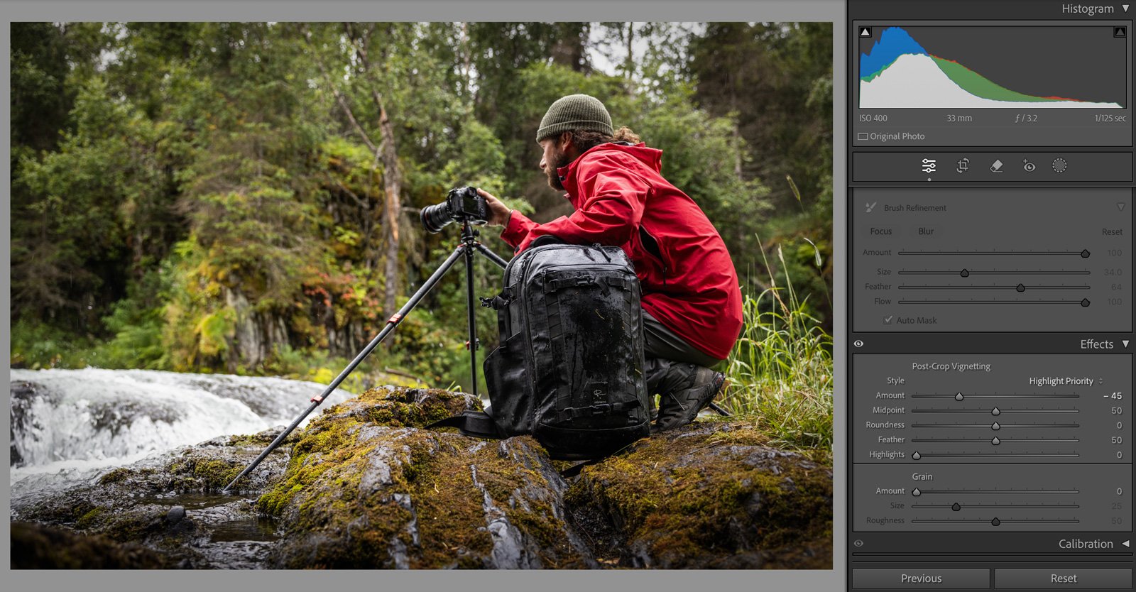
The vignette tool was trendy once upon a time, but today, it can easily make your work feel dated or lazy. While adding a vignette can help focus attention on your subject, there are better ways to achieve this effect:
Use a gradient filter or a brush to darken certain areas and direct the viewer's attention more naturally.
Alternatively, use the vignette tool but apply AI-based subject masking so the vignette affects only the background, not the subject.
basic vignette applied
Darker gradient added to bottom and the top with the subject de-selected
4. Sharpening the Wrong Way
Sharpening is another area where it’s easy to go too far. It can either enhance your photo beautifully or add unwanted noise and make things look overly crisp. Here’s a quick breakdown of the sharpening sliders:
Amount: How strong the sharpening effect is.
Radius: How many pixels from the edges the sharpening will affect— Personally i usually stick to a radius of 1 for subtlety.
Detail: How many edges are sharpened—use caution here with skin tones, as sharpening too many details can emphasize pores and imperfections where as if your sharpening a bears fur or the featers on a bird you might want to ggrab that extra detail!
Masking: This is crucial! Hold down the Option key (or Alt on Windows) to bring up a black-and-white preview. The areas in white will be sharpened, and the black areas won’t. Use this tool to keep flat areas like the sky untouched and focus sharpening only on important details like a bird’s feathers or fur.
By mastering these controls, you’ll sharpen your image with precision without creating unnecessary noise.
an example of the masking while holding option
the green looks clean and sharp while the red looks grainy and messy
5. Crooked Horizons—The Cardinal Sin
If there’s one thing that will ruin even the most beautiful photograph, it’s an off-kilter horizon. This might seem like a small thing, but a tilted horizon is incredibly distracting and immediately detracts from the image's impact.
Make it a habit to check the horizon line before you export any photo. Many editing tools, like Lightroom, even have an auto-leveling function—use it! This simple step will elevate the professionalism of your work instantly.
you can see that the horizon is slightly off - to change the overlay in lightroom tap O while in the crop and straiten panel
Perfectly levelled using the Auto level
Final Thoughts
Editing in my opinion is meant to enhance what’s already there, not overwhelm or mask it. Subtle edits will always stand the test of time, while heavy-handed adjustments tend to look dated and amateur. The key is to be thoughtful with every slider and understand that sometimes, less really is more.
By using these tips—gentle presence adjustments, balanced color enhancements, selective sharpening, and perfectly aligned horizons—you’ll create polished images that grab attention for all the right reasons. So next time you’re in post-processing, take a breath, be selective with where in the image you’re editing and let your photo editing will so much better!
Happy editing!


